
Tech
Why Pxless is the Future of Modern Responsive Web Design

The digital landscape is shifting faster than ever. For years, web designers relied on fixed pixels to build websites, but the explosion of diverse screen sizes has rendered this approach obsolete. Today, adopting a Pxless mindset is no longer just a luxury—it is an absolute necessity for modern web development.
When we talk about going Pxless, we are referring to the practice of moving away from absolute pixel measurements (px). Instead, developers are embracing relative units like percentages, viewport widths, and font-relative measurements. This shift ensures that layouts look flawless whether they are viewed on a massive desktop monitor or a compact smartwatch.
Let us dive deep into how this design philosophy works, why it is replacing traditional layouts, and how you can implement it in your own digital projects.
The Evolution of Web Layouts: Moving to a Pxless World
To understand where we are going, we have to look at where we started. In the early days of the internet, websites were designed for a standard desktop resolution. Designers knew exactly how wide a screen was, so they built everything using rigid, fixed pixel measurements.
This approach shattered when smartphones entered the market. Suddenly, a sidebar that looked perfect on a desktop completely broke on a mobile device.
The Rise of Fixed Pixel Grid Systems
For a while, developers used media queries to patch these holes. They would set specific “breakpoints” using pixels to shift the layout around. While this worked for a time, it created massive codebases that were incredibly tedious to maintain. Every new device size meant adding a new set of rules.
Why Fixed Pixels Struggle Today
Pixels are static, absolute units. A screen with high pixel density (like a Retina display) renders a 12px font much differently than an older, standard monitor. If your layout relies purely on fixed measurements, you risk alienating users who rely on screen zoom or accessibility features to read your content.
Understanding the Core Units of Pxless Design
Shifting your workflow to a Pxless environment means learning to speak a new measurement language. You are not getting rid of measurements entirely; you are just swapping static numbers for dynamic relationships.
Here are the most important relative units you will use to achieve a fluid design.
1. Font-Relative Units: EM and REM
Instead of setting font sizes and spacing in pixels, modern CSS uses em and rem. Both are based on font sizes rather than screen dots.
-
REM (Root EM): This unit scales based on the root font size of the website (usually the standard 16px set by the browser). If the root is 16px, then
1remequals 16px, and2remequals 32px. -
EM: This unit scales based on the font size of its immediate parent container. It is incredibly useful for padding and margins inside a specific component.
Using rem is the gold standard for accessible typography. If a user changes their browser’s default font size for visual comfort, your entire website automatically scales up proportionally.
2. Viewport-Relative Units: VW and VH
Sometimes you want elements to scale based on the physical size of the browser window. This is where viewport units shine.
-
VW (Viewport Width): One unit equals 1% of the browser window’s width.
-
VH (Viewport Height): One unit equals 1% of the browser window’s height.
Imagine building a hero banner that needs to take up the exact height of a mobile screen. Setting the height to 100vh ensures it fills the screen perfectly without any awkward gaps or overflow.
3. Percentages (%)
Percentages are the classic fluid unit. They determine how much space an element should take up relative to the container it sits inside. If a main content block is set to 75% and a sidebar is set to 25%, they will always sit side-by-side perfectly, no matter how wide the screen is.
The Major Benefits of Going Pxless
Switching your workflow requires a bit of a learning curve, but the rewards are massive. Designing with relative units impacts everything from user experience to backend maintenance. Here is why top-tier developers are making the leap.
Flawless Accessibility
Accessibility is a massive ranking factor for modern search engines. When you build a site using rem and percentages, you are designing with empathy. Users with visual impairments can scale their browser text up to 200%, and a Pxless layout will reorganize itself beautifully without text overlapping or breaking container boundaries.
Dramatically Reduced Code Size
When your layout is naturally fluid, you do not need hundreds of lines of media queries to fix broken layouts. Elements resize themselves dynamically. This means cleaner stylesheets, faster website loading times, and a much lighter footprint on your server.
Future-Proof Architecture
New hardware hits the shelves every single month. We have foldable phones, ultra-wide curved monitors, and smart home refrigerator screens. A Pxless web architecture adapts instantly to devices that have not even been invented yet. You do not have to update your CSS breakpoints every time a tech giant releases a new phone model.
How to Implement a Pxless Strategy: Best Practices
Ready to transition your workflow? Going Pxless requires a change in how you think about spatial relationships on a screen. Here are actionable tips to make the transition smooth.
Establish a Global Base Size
The secret to seamless scaling is setting a clean baseline. Most browsers default to a font size of 16px. You can use simple CSS rules to reset your base and make your math much easier. Many developers set the root HTML font size to 62.5%. This makes 1rem equal to exactly 10px, making your conversions incredibly simple.
Leverage Modern CSS Functions
Modern web standards have introduced incredible tools that make absolute pixels obsolete. You should actively integrate these three functions into your stylesheets:
-
Clamp(): This allows you to set a minimum, ideal, and maximum size for an element. For example, a heading can fluidly scale between a mobile size and a desktop size without needing breakpoints.
-
Min() & Max(): These help you set boundaries so your text or images never become too tiny or unreadable on edge-case screens.
Think in Proportions, Not Grid Boxes
When sketching out wireframes, do not think “this box is 400 pixels wide.” Instead, think “this box takes up one-third of the screen width.” Modern CSS layouts like Flexbox and CSS Grid are specifically designed to handle these proportional relationships without rigid math.
Common Challenges and How to Overcome Them
While the Pxless methodology is the superior way to build the modern web, it does come with a few hurdles. Knowing how to navigate them will save you hours of debugging.
The Math Headache
Converting pixels from a designer’s mockup (usually built in Figma or Sketch) into rem units can feel tedious at first.
Pro Tip: Use online conversion tools or plugins within your code editor. Many modern extensions let you type “24px” and will instantly convert it to the proper
remvalue for you.
Image Blurring and Distortion
While text and layouts scale beautifully, raster images (like JPGs and PNGs) can become blurry if they are stretched too far. To maintain a sharp visual identity, use SVG (Scalable Vector Graphics) for logos, icons, and illustrations. For standard photos, utilize the srcset attribute to serve different image resolutions based on the screen’s actual pixel density.
Border Thickness
This is the one area where pixels might still reign supreme. If you want a razor-thin, elegant 1-pixel border around a card, setting it in relative units can sometimes make it look blurry or invisible on low-resolution screens. Many purists still utilize a single static pixel for standard border strokes while keeping the rest of the layout fluid.
Pxless Design and Search Engine Visibility
Beyond just looking good, fluid layouts have a massive impact on your site’s SEO performance. Search algorithms favor websites that provide an elite mobile experience.
Core Web Vitals Tracking
Google uses a metric called Cumulative Layout Shift (CLS) to measure visual stability. If static elements shift around awkwardly as a page loads, your SEO score drops. Fluid, relative containers reserve space predictably, helping you pass visual stability tests with flying colors.
Mobile-First Indexing
Search engines analyze the mobile version of your site to determine its rankings. If a bot crawls your site and finds overlapping text or hidden buttons caused by rigid pixel containers, your rankings will tank. Smooth scaling ensures search bots see a perfectly legible, structured page.
Conclusion
The transition to a Pxless digital environment is a natural step in the evolution of internet media. By letting go of static, absolute dots and embracing proportional, relative measurements, we create a web that is faster, more accessible, and ready for whatever hardware the future brings.
Whether you are a seasoned front-end developer or a brand-new website owner, auditing your stylesheets and swapping rigid pixels for fluid units is one of the highest-value upgrades you can make today. It streamlines your code, boosts your search engine ranking, and provides an unparalleled browsing experience for every single visitor.
Are you ready to optimize your current site architecture? Let us discuss how we can transition your existing platform over to a modern, fluid framework!
Frequently Asked Questions (FAQs)
1. What exactly does it mean to go Pxless?
Going pxless means replacing absolute pixel measurements (px) in your website’s code with relative units like rem, em, %, vw, and vh. Instead of forcing a box to be a static size, the layout scales naturally based on the size of the screen or the user’s base font preferences.
2. Is it bad to use pixels at all in web development?
Not at all. Pixels are still great for things that should never scale, such as fine divider lines, hairline borders, or thin box shadows. The goal is to avoid using pixels for structural things like typography, padding, container widths, and margins.
3. How do relative units help with website accessibility?
Many users change their browser’s default settings to make text larger for easier reading. If you use static pixels, the site ignores these settings. If you use relative units like rem, the text automatically adjusts to match the user’s vision needs without breaking the webpage’s layout.
4. What is the difference between EM and REM?
Both are relative units, but they pull their base numbers from different places. A rem unit is tied to the root of the document (the browser’s base setting). An em unit is tied to the font size of its immediate parent element. Most developers prefer rem for global layout building because it prevents complicated compound-scaling issues.
5. Will removing pixels make my website load faster?
Yes! When layouts are naturally fluid, you do not need to write hundreds of lines of complex CSS media queries to fix elements for different phone models. Less code means smaller file sizes, which directly translates to faster page loading speeds and better server efficiency.
This video on Advanced CSS Units and Visual scaling offers a practical look at how relative units behave in modern browser environments, making it a great visual supplement to the principles discussed above.


What Is Lufanest?
Lufanest is an emerging modern term often linked with comfort, creativity, balance, and digital growth.
It can describe a lifestyle idea, a brand concept, a platform name, or a creative space built around progress.
Because the word is still developing, its meaning depends on how people use it in real life.
The “Quick Bio” Feature Table
| Feature | Details |
|---|---|
| Main Keyword | lufanest |
| Topic Type | Emerging concept, lifestyle idea, digital identity, and branding term |
| Core Meaning | A flexible idea connected with comfort, growth, creativity, and modern living |
| Common Uses | Branding, online platforms, lifestyle content, digital communities, creative projects |
| Best For | Startups, writers, creators, wellness brands, tech platforms, and modern blogs |
| Tone of the Concept | Calm, innovative, supportive, and future-focused |
| Main Benefit | Helps create a unique identity around comfort, simplicity, and growth |
| Current Relevance | Useful for digital naming, content creation, and modern brand positioning |
Understanding the Meaning of Lufanest
The word lufanest does not have one old or fixed meaning. That is what makes it interesting. Some terms come from history, science, or language roots, but this one feels more like a modern invented word. It gives people room to shape its meaning according to their project, brand, or personal idea.
At its simplest, the term can be understood as a mix of two feelings: a safe space and a forward-moving idea. The “nest” part gives a sense of comfort, protection, home, and belonging. The first part of the word gives it a fresh and modern sound. Together, it feels suitable for something creative, peaceful, digital, or lifestyle-based.
This flexibility makes the term useful in many areas. A wellness brand may use it to show calm living. A technology platform may use it to suggest a smart and user-friendly space. A blog may use it to explore modern habits, personal growth, or online communities. The meaning is not limited to one industry, which gives it strong branding potential.
Why Lufanest Is Getting Attention
New words often become popular because people want fresh identities. In a crowded online world, common names are difficult to rank, protect, and remember. A unique word gives a brand more space to stand out. That is one reason lufanest can attract interest.
It sounds modern without being too technical. It also feels warm without being too casual. This balance matters because many users today want digital experiences that are simple, safe, and human. They do not only want speed. They also want trust, comfort, and clarity.
Another reason for its appeal is curiosity. When people see an unfamiliar word, they often search for its meaning. This can help content creators build topical coverage around the term. However, the content must explain the idea clearly. If the meaning feels vague or forced, readers may leave quickly.
Lufanest as a Lifestyle Concept
As a lifestyle idea, lufanest can represent calm, intentional, and balanced living. It can be used to describe a personal environment where someone feels supported, focused, and free from unnecessary pressure.
Modern life is often busy. People manage work, social media, family duties, studies, and personal goals at the same time. A lifestyle built around this concept would focus on reducing noise and creating a more peaceful routine. It may include clean spaces, better planning, mindful technology use, and healthier daily choices.
This does not mean living a perfect life. It means building a space where growth feels easier. A person may create a small home office, reduce digital distractions, organize their schedule, or choose simpler habits. The goal is not luxury. The goal is comfort with purpose.
Lufanest in Digital Spaces
The digital world is full of platforms, apps, blogs, and online communities. Many of them compete for attention. A concept like lufanest can work well in digital spaces because it suggests a place where users can feel guided rather than overwhelmed.
For example, an online platform using this idea could focus on easy navigation, clean design, helpful content, and strong privacy. A community website could use it to create a welcoming environment for learning and discussion. A digital wellness blog could use it to talk about screen balance, productivity, and healthier online habits.
The strongest digital use of this concept would be human-centered. Users should feel that the platform respects their time. Pages should load clearly. Content should answer real questions. Design should feel simple. When technology feels calm and useful, people are more likely to trust it.
Branding Value of Lufanest
From a branding point of view, lufanest has several advantages. It is short, memorable, and flexible. It does not lock a business into one narrow category. A brand could use it for lifestyle products, a tech tool, a creative studio, a wellness project, or a modern blog.
A strong brand name should be easy to remember and easy to build around. This word has a soft sound, which makes it suitable for friendly and supportive branding. It can work with calm colors, clean typography, and messages about growth, comfort, and simplicity.
However, a flexible name also needs a clear brand story. If a business uses this term without explaining what it means, customers may feel confused. The brand should define its purpose in simple words. It should tell users what it offers, who it helps, and why the name matters.
Key Benefits of the Lufanest Concept
One major benefit is originality. In online marketing, original terms can help create a unique identity. They are easier to shape because they are not already overloaded with meaning.
Another benefit is emotional appeal. The word suggests comfort and safety. These emotions are useful for brands that want to build trust. People are more likely to connect with a name that feels calm and positive.
The concept also supports adaptability. It can grow with a business or project. A small blog may begin with lifestyle content and later expand into digital tools, community features, or products. Because the term is broad, it can support that growth.
It can also help with content planning. Writers can explore many related angles, such as modern living, digital balance, creative spaces, branding, productivity, wellness, and online identity. This gives the topic enough depth for articles, guides, FAQs, and category pages.
How Lufanest Can Be Used in Business
A business can use this concept in several practical ways. First, it can become a brand name. A startup may choose it because it feels modern and different. Second, it can become a content theme. A website may publish guides about comfort, innovation, and balanced living under this idea.
Third, it can support product positioning. For example, a home decor brand could connect it with cozy spaces. A productivity app could connect it with calm planning. A learning platform could connect it with a safe place for growth.
The important point is consistency. A business should not use the word randomly. Every page, product, and message should support the same feeling. If the brand promises simplicity, the website should be simple. If it promises comfort, the customer experience should feel smooth. If it promises growth, the content should actually help users improve something.
Lufanest and Modern Content Strategy
For content creators, lufanest offers a useful topic because it can connect several related ideas. A writer can explain its meaning, compare possible uses, discuss lifestyle value, explore branding potential, and answer common questions.
Good content should avoid overusing the keyword. Readers notice when a word is repeated too often. Search engines also prefer natural writing that answers the user’s intent. The keyword should appear in important areas like the title, opening paragraph, headings, and a few natural places in the body.
The article should also include related terms. These may include modern lifestyle, digital comfort, online identity, creative branding, mindful living, user experience, innovation, and personal growth. These phrases help cover the topic without making the writing sound forced.
Challenges Around Lufanest
The biggest challenge is unclear meaning. Since the term is still new, different websites or creators may explain it in different ways. This can create confusion for readers.
Another challenge is trust. People may hesitate when they see a word they do not recognize. That is why clear explanation is important. A page should define the concept early and then support it with examples.
There is also a risk of shallow content. Some articles may use new terms without adding real value. To avoid that, writers should give practical uses, honest limitations, and helpful context. A strong article should not only say the word is modern. It should explain how the idea can be applied.
Future Potential of Lufanest
The future of lufanest depends on how people use it. If brands, creators, and platforms give it a clear identity, it can become a useful concept in modern content and digital branding. If it remains too vague, it may only stay as a curiosity keyword.
Its strongest future may be in areas where people want both comfort and innovation. These include wellness platforms, lifestyle blogs, digital communities, productivity tools, creative agencies, and personal growth brands. The word can also work well for projects that want a softer alternative to cold technical branding.
As online users become more selective, names that feel human may become more valuable. People do not only want tools. They want experiences that feel simple, safe, and meaningful. This is where the concept can fit naturally.
How to Build a Clear Identity Around Lufanest
To build a clear identity around this term, start with a simple definition. Do not make the meaning too complicated. A good definition could connect comfort, growth, creativity, and modern living.
Next, choose a clear audience. Is the concept for tech users, homeowners, creators, students, wellness readers, or business owners? A broad word becomes stronger when it speaks to a specific group.
Then create a consistent tone. The writing should feel calm, helpful, and confident. The design should match the message. Soft colors, clean layouts, and simple navigation can support the idea well.
Finally, offer real value. If the topic is used for a blog, the articles should solve problems. If it is used for a platform, the features should be useful. If it is used for a brand, the products should match the promise.
Conclusion
Lufanest is a modern and flexible concept with growing potential in lifestyle, branding, content, and digital spaces. Its strength comes from its open meaning. It can represent comfort, creativity, safety, growth, and innovation without being limited to one category.
For readers, it can describe a better way to think about personal space, online experience, and balanced living. For businesses, it can become a memorable identity if it is supported by a clear message. For content creators, it offers a fresh topic with many natural angles.
The key is clarity. A new word only becomes valuable when people understand it. When explained well, lufanest can become more than a search term. It can become a meaningful idea for modern living and digital growth.
FAQs About Lufanest
1. What does lufanest mean?
Lufanest is an emerging modern term often connected with comfort, creativity, growth, and digital identity. It does not have one fixed dictionary meaning, so its use depends on the context.
2. Is lufanest a brand or a concept?
It can be both. Some people may use it as a brand name, while others may use it as a concept for lifestyle, technology, online communities, or creative projects.
3. Why is lufanest useful for branding?
It is useful because it sounds unique, modern, and memorable. A business can shape its meaning around comfort, innovation, trust, and personal growth.
4. Can lufanest be used for a website or blog?
Yes, it can work well for a website or blog focused on lifestyle, digital wellness, branding, creativity, productivity, or modern living.
5. What is the future of lufanest?
Its future depends on how clearly people define and use it. With strong content, consistent branding, and practical value, it can grow into a recognizable modern concept.
Also Read… Thebaseleg.com
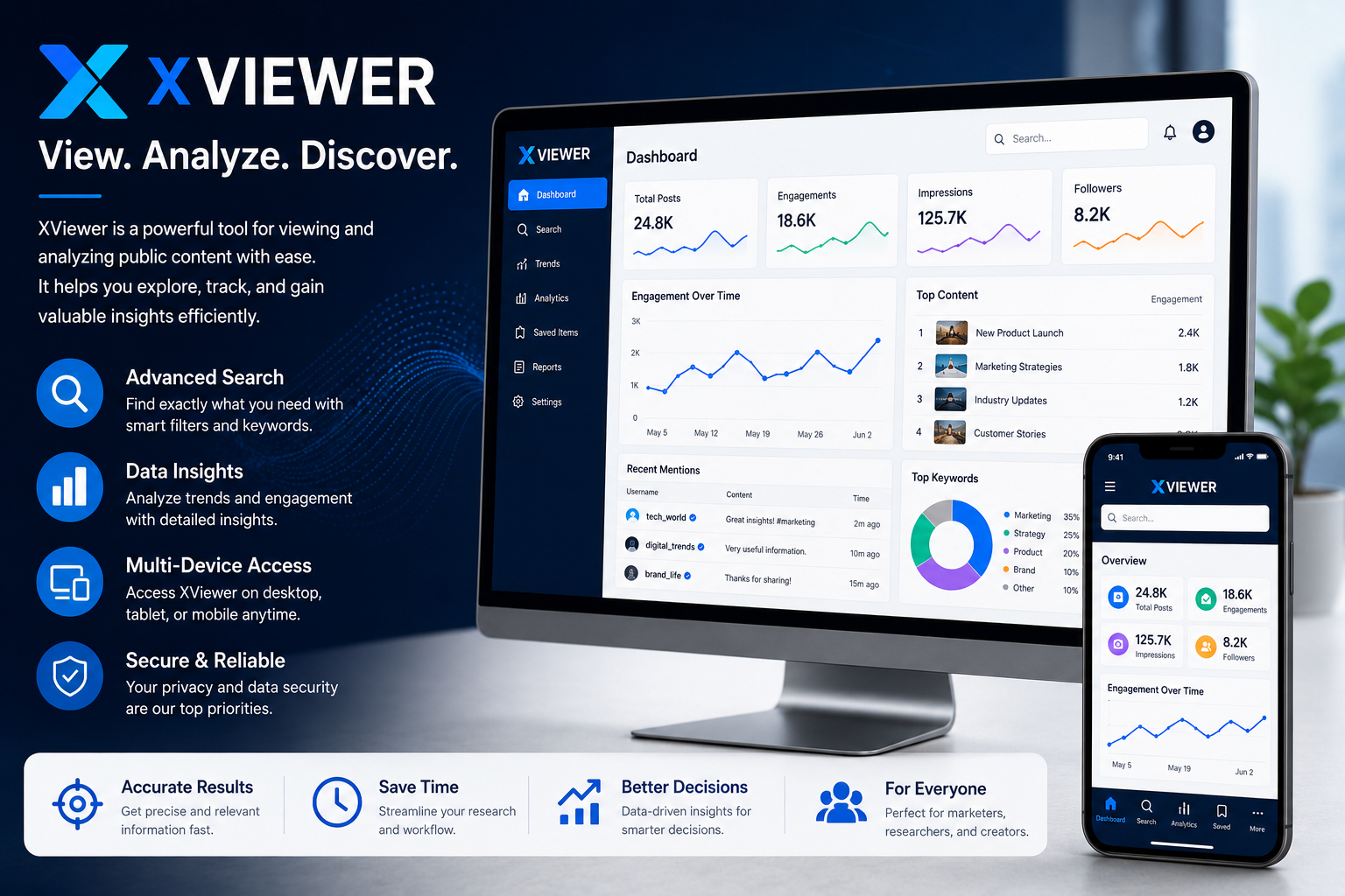
XViewer has gained attention as a tool associated with viewing, analyzing, and managing online content across different platforms. Users often search for XViewer when looking for ways to explore public information, improve content analysis, or streamline digital workflows Its growing popularity stems from simplicity, accessibility, and the ability to provide users with a more organized viewing experience. Whether used for research, content monitoring, or information gathering, XViewer continues to attract interest from a broad audience Understanding how XViewer works, its capabilities, and its limitations can help users determine whether it fits their specific needs.
Quick Bio
| Feature | Details |
|---|---|
| Keyword | XViewer |
| Category | Viewing and Content Analysis Tool |
| Primary Purpose | Viewing and analyzing publicly accessible content |
| Origin | Modern web-based utility concept |
| Industry | Technology & Digital Media |
| Common Platform | Web Browsers and Mobile Devices |
| Main Users | Researchers, marketers, content creators, analysts |
| Core Function | Content viewing and information monitoring |
| Popular Applications | Social media analysis, research, trend tracking |
| Accessibility | Browser-based and device-friendly |
| Key Benefit | Simplified content exploration |
| Future Potential | AI-assisted analytics and deeper insights |
What Is XViewer?
A tool named XViewer lets people look at public data more clearly. When set up one way or another, it can include features that follow what shows up often online. Some versions let you move through posts easily, while others highlight how many interact. Watching activity shifts might be possible, depending on how it is used.
What stands out about XViewer is how neatly it organizes things, so finding what you need feels natural. Some folks stick with it simply because clutter never creeps in. A clear layout shows up right away, making the whole process less of a hunt. It just works without extra steps getting in the way.
The Origins of XViewer
The concept behind XViewer emerged from the growing need for efficient content exploration tools. As digital platforms expanded, users required better methods to locate and evaluate public information.
This demand encouraged the development of specialized viewers capable of improving accessibility and organization.
How XViewer Works
At its core, XViewer collects and displays publicly accessible content in a structured format. Instead of manually navigating large volumes of information, users can review relevant data through a single interface.
This approach often improves efficiency and saves time during research activities.
Data Collection Methods
Most viewing platforms rely on publicly available sources. Information is gathered, organized, and displayed according to user preferences or search parameters.
The process emphasizes accessibility while maintaining compliance with platform guidelines.
User Interface Design
A clean interface remains one of the most important aspects of XViewer. Effective design allows users to locate information quickly without unnecessary complexity.
Simple navigation contributes significantly to user satisfaction.
Key Features of XViewer
Several features distinguish XViewer from traditional browsing methods.
Advanced Search Capabilities
Users can often locate specific information through filters, keywords, and categorized search functions. These options reduce the time required to find relevant content.
Content Organization
Information is typically displayed in a structured format that improves readability and navigation.
Accessibility Across Devices
Many XViewer solutions support desktops, tablets, and smartphones, allowing users to work from virtually anywhere.
Common Applications of XViewer
The versatility of XViewer contributes to its growing adoption.
Research and Analysis
Researchers use viewing tools to monitor public discussions, identify trends, and gather insights.
Marketing Intelligence
Digital marketers frequently analyze public engagement patterns to improve campaign strategies.
Content Monitoring
Organizations may use XViewer to track mentions, conversations, and industry developments.
Benefits of Using XViewer
The popularity of XViewer is closely linked to the practical benefits it offers.
Improved efficiency, better organization, and faster information discovery are among the most frequently cited advantages.
Users can focus on analysis rather than spending excessive time locating content.
Industries That Utilize XViewer
Multiple industries benefit from viewing and analysis technologies.
Digital Marketing
Marketers monitor audience interests and emerging trends.
Journalism
Journalists often use content viewing tools during investigations and research projects.
Academic Research
Researchers evaluate publicly available information to support studies and reports.
Privacy and Security Considerations
Whenever users engage with online viewing tools, privacy should remain a priority.
Responsible use involves understanding platform policies, respecting user rights, and focusing only on publicly accessible information.
Maintaining ethical standards helps ensure long-term trust and reliability.
Comparing XViewer With Traditional Browsing
Traditional browsing often requires users to switch between multiple pages and sources.
By contrast, XViewer centralizes information, making navigation more efficient and reducing unnecessary steps.
This streamlined approach can significantly improve productivity.
Commercial Variations of XViewer
Different versions of XViewer may target specific audiences.
Some focus on casual users seeking convenience, while others provide advanced analytics for professional environments.
Premium versions often include enhanced reporting and monitoring capabilities.
Regional Adoption and Market Trends
Interest in XViewer varies across regions.
Areas with strong digital engagement typically show higher adoption rates due to increased demand for content analysis and monitoring tools.
Businesses in competitive markets often seek solutions that provide quicker access to relevant information.
Challenges Associated With XViewer
Like any technology, XViewer faces certain challenges.
These may include platform restrictions, evolving privacy regulations, and increasing expectations for advanced analytics.
Developers must continually adapt to changing user needs.
Future Trends Shaping XViewer
The future of XViewer appears closely tied to advancements in artificial intelligence and automation.
Emerging developments may include smarter content categorization, predictive insights, and improved visualization tools.
These enhancements could make information analysis more accessible than ever before.
AI-Powered Insights
Artificial intelligence may help identify patterns that would otherwise remain hidden within large datasets.
Enhanced Personalization
Future versions may provide customized dashboards based on user behavior and interests.
Real-Time Monitoring
Faster data processing could enable more accurate and immediate updates.
Best Practices for Using XViewer
Users can maximize results by following several practical guidelines.
- Focus on clearly defined objectives.
- Use search filters effectively.
- Verify information through multiple sources.
- Respect privacy and platform policies.
- Review data regularly for accuracy.
Applying these practices improves both efficiency and reliability.
Why XViewer Continues to Gain Attention
More people online means more need for ways to find stuff easily. Tools that help sort through information now matter a lot. With clicks rising everywhere, simpler methods stand out. Finding things fast becomes normal, not special. The hunt for clarity grows alongside screen time.
With XViewer, sorting through data feels less like a chore because the layout keeps things clear. Not just for experts – anyone who opens it notices how smoothly details come together. What matters shows up first, so time gets spent on thinking instead of searching.
Conclusion
XViewer represents a practical solution for individuals and organizations seeking more efficient ways to access, organize, and analyze publicly available information. Its combination of accessibility, structured presentation, and expanding functionality makes it relevant across multiple industries. As technology evolves, XViewer is likely to become even more capable through automation, personalization, and advanced analytical features, helping users make better-informed decisions while saving valuable time.
FAQs
1. What is XViewer primarily used for?
XViewer is primarily used for viewing, organizing, and analyzing publicly accessible information in a structured and user-friendly format.
2. Is XViewer suitable for professional research?
Yes. Researchers, marketers, journalists, and analysts often use XViewer to gather insights, monitor trends, and improve information discovery.
3. Can XViewer be accessed on mobile devices?
Many XViewer solutions are designed to work across desktops, tablets, and smartphones, allowing flexible access from different devices.
4. Does XViewer provide real-time information?
Some implementations offer real-time monitoring capabilities, though available features depend on the specific version or platform.
5. What future improvements can be expected in XViewer?
Future developments may include AI-powered analytics, personalized dashboards, enhanced search capabilities, and more sophisticated data visualization tools.


SFM Compile: The Complete Guide to Compiling Models, Maps, and Assets in Source Filmmaker

Best Ensalada de Arvejas y Jamon Near Me: A Fresh Guide to This Creamy Classic

Mansutfer: Meaning, Uses, Benefits and Future Value

Pabington: The Definitive Guide to a New Era of Lifestyle and Design

Galoble: The Definitive Guide to Global Connectivity and Local Synergy in the Digital Age

AHGRL: The Definitive Guide to Advanced Hybrid Governance and Resource Logic
-
 Blogs3 months ago
Pabington: The Definitive Guide to a New Era of Lifestyle and Design
-
 Blogs3 months ago
Galoble: The Definitive Guide to Global Connectivity and Local Synergy in the Digital Age
-
 Blogs3 months ago
AHGRL: The Definitive Guide to Advanced Hybrid Governance and Resource Logic
-

 Tech3 months ago
Fanquer: The Definitive Guide to the New Frontier of Digital Engagement
-

 Blogs3 months ago
Printely: The Future of Personalized Printing and Digital Commerce
-

 Tech3 months ago
Cñims: The Future of Integrated Digital Management Systems in 2026
-

 Tech3 months ago
DowsStrike2045 Python: The Definitive Guide to Next-Gen Framework Management
-

 Sports3 months ago
Cricfooty: The Ultimate Digital Hub for Cricket and Football Fans